Program Page Redesign

You are out with your friends on a Friday night for some fun, booze, and to sing one of your favorite songs, but digital PDF just kills the vibe. You have no way to search the list and waste so much time looking for a song to start the fun.

Work

Skagit Valley College

Timeline

Nov 2024 – Jun 2025

Role

UX/UI Designer & Developer

Tools: Miro, Figma, Modern Campus CMS, Microsoft Clarity, Google Analytics, Siteimprove

Overview

Skagit Valley College’s program pages were redesigned to create a unified, student-centered experience. The previous version was inconsistent, outdated, and lacked clear calls to action—leaving users unsure where to go or how to apply.

The new design introduced a modular template applied across 100+ programs, featuring clear structure, visual engagement, and quick access to next steps such as “Apply Now” and “Request Information.”

Problem:

  • Each page had a different layout, making it hard for students to locate degree or certificate details.
  • Outdated and missing content caused confusion and frustration.
  • Calls to action were buried or inconsistent.
  • Users frequently exited after landing on a program page—high bounce rates and short engagement times confirmed poor usability.
  • There wasn’t a page for each program/degree/certificate we offered. RED FLAG!

Research & Discovery

To understand how users navigated and where they were getting lost:

  • Audited 100+ program pages to identify gaps, broken links, and inconsistencies.
  • Reviewed analytics (GA4, Search Console) to trace student paths and bounce behavior.
  • Watched Clarity heatmaps & session recordings showing users scrolling aimlessly or rage-clicking inactive CTAs.
  • Collaborated with outreach and advising teams to define clear CTAs and essential program content.
  • Benchmarked competitor institutions to align information hierarchy and visual clarity.

Findings showed that users often relied solely on search, missed CTAs, and dropped off before reaching application links.

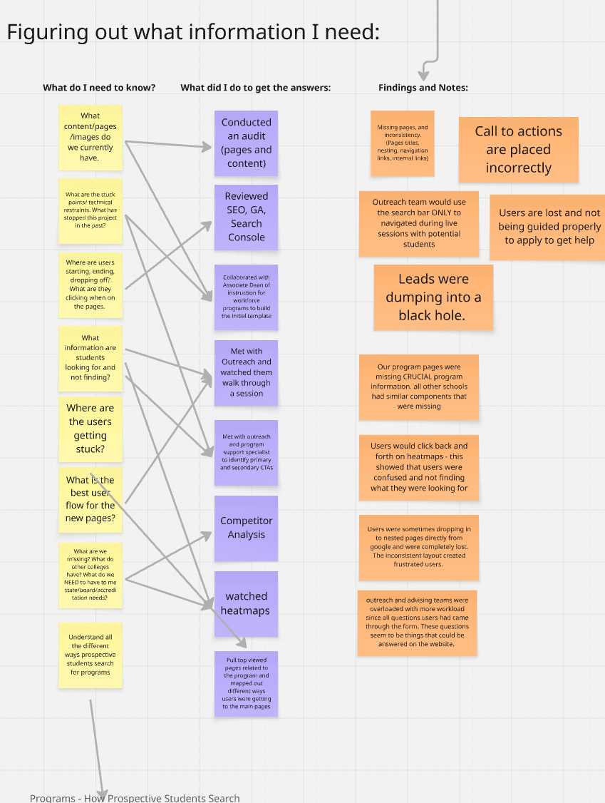
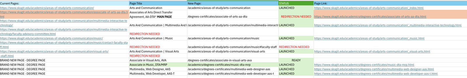
Before any design work, I built a master audit spreadsheet to inventory all existing program pages, assets, and communication threads.
The sheet served as both a content tracker and project control hub—documenting:

  • Page URLs, ownership, and status (missing, outdated, duplicated)
  • Visual assets, accessibility issues, and broken links
  • Internal communications and approval history

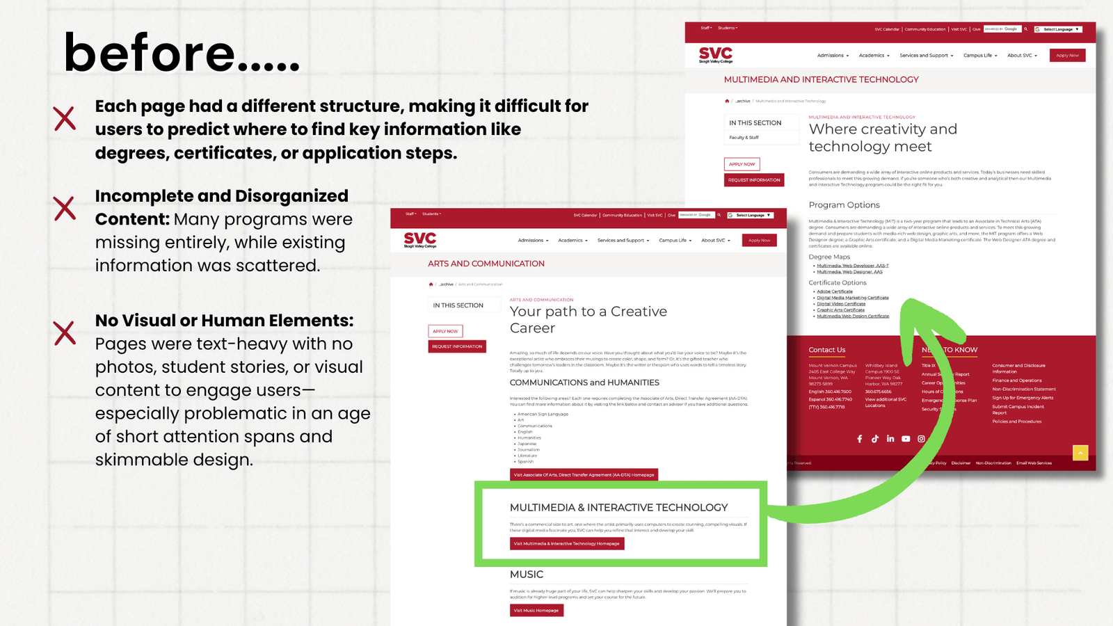
This systemized approach uncovered major inconsistencies, redundant content, and missing programs while also streamlining collaboration across departments during migration and redesign.

Recognizing that the redesign couldn’t succeed within marketing alone, I assembled a working group spanning academics, advising, and outreach.
This team provided subject-matter input and took partial ownership of content accuracy—ensuring the new templates were sustainable long-term.
By bridging communication gaps between departments, we established clear content accountability and improved how updates flow from program experts to the web team.
This structure also reduced dependency on marketing for every minor edit, saving significant internal time and reinforcing consistency.

click to enlarge image

Behavior Analytics & User Flow Insights

Through Google Analytics and path exploration data, I identified that most visitors landed directly on “Areas of Study” or individual program pages—but frequently looped back or exited without taking action.
Heatmaps and journey mapping confirmed the issue: users were scrolling past critical CTAs, revisiting the same pages, and dropping off before reaching “Request Information.”
This analysis proved that unclear navigation and inconsistent layouts were driving high bounce rates. These findings directly informed the new content hierarchy, CTA placement, and page flow design in the redesign.

Solution

  • Designed a unified template system for all program pages with a predictable content hierarchy.
  • Added hero imagery and student stories to humanize content.
  • Consolidated next steps—“Apply Now”, “Request Info”, and “Get Started”—front and center.
  • Improved mobile responsiveness and accessibility compliance (WCAG 2.1).
  • Streamlined backend content management for departments via structured CMS reusable blocks.

Impact

Primary Goal: Reduce bounce rate and increase engagement across program pages.

Program PageBefore BounceAfter BounceImprovement
Human Services11%2%↓ 79%
Fire Science5%4%↓ 33%
Automotive Technology5%4%↓ 26%
Overall (Program Pages)5.1%4.9%↓ 3%

Additional outcomes:

  • Users now spend longer on page and interact with next-step CTAs.
  • Analytics show smoother navigation flows with fewer backtracks.
  • Content teams can update pages 3× faster due to simplified templates.

Takeaway

By combining data-driven UX research with scalable design systems, the project transformed fragmented, static content into an actionable student journey.
The redesign reduced friction, improved wayfinding, and better represented the college’s academic offerings—helping students move from exploration to enrollment with confidence.