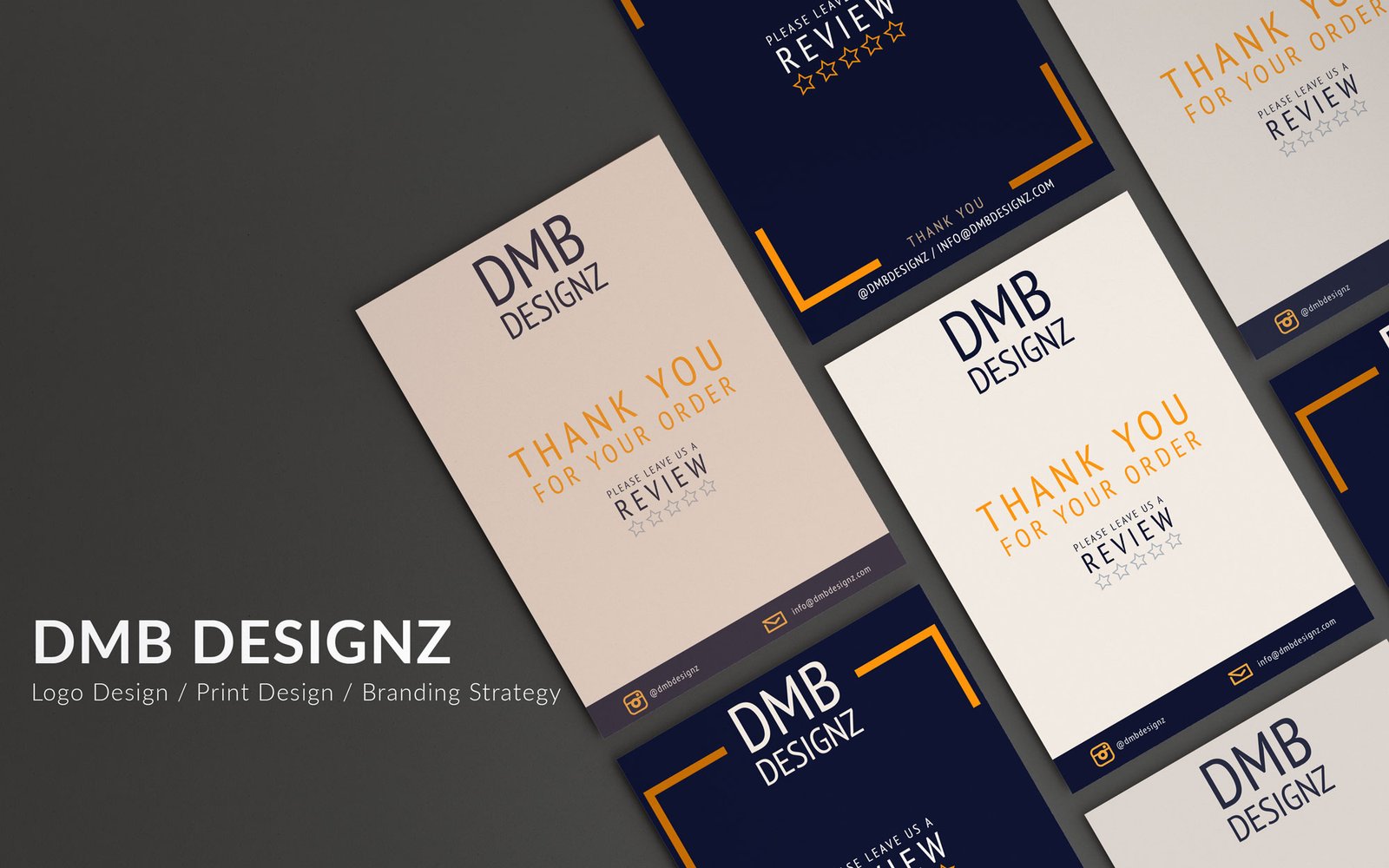
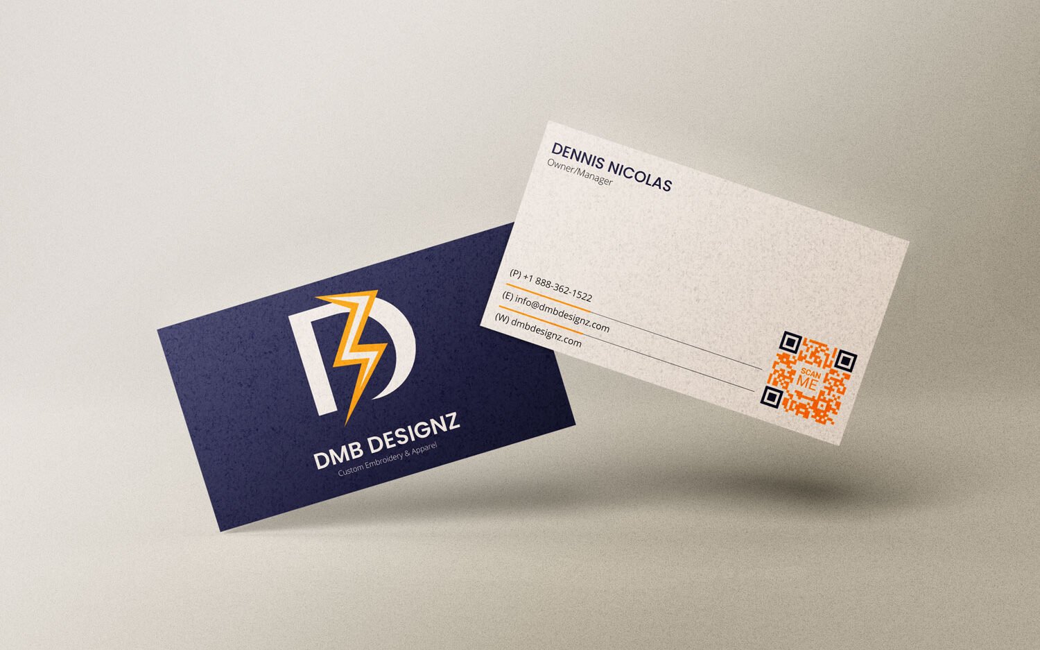
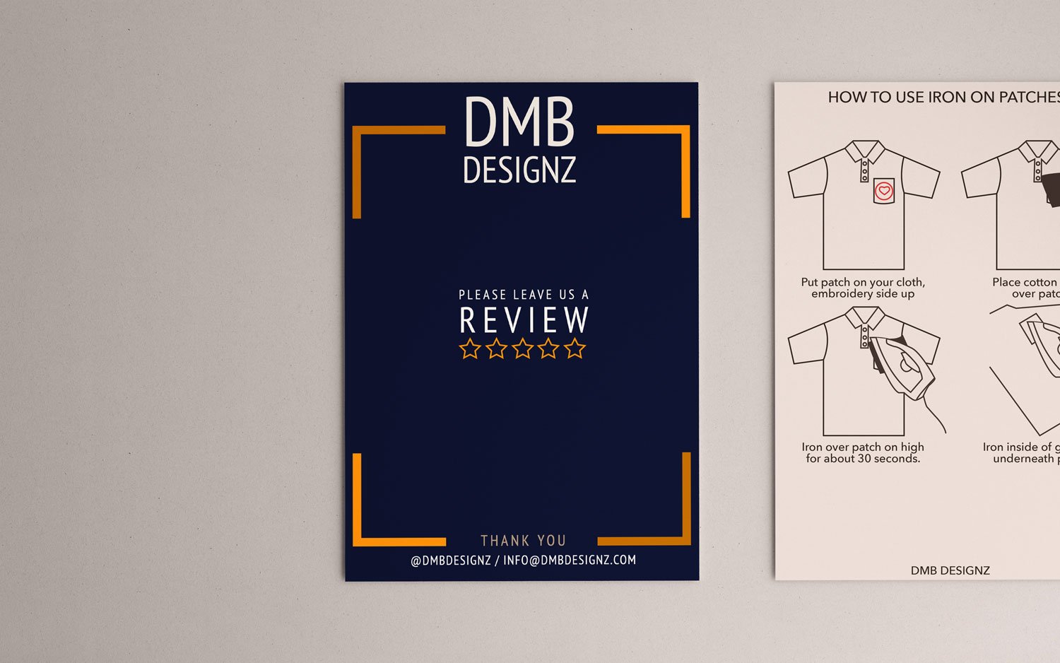
The client wanted something simple and straight to the point. He loved the color blue and wanted to make it his primary color. The logo was inspired by the DMB letters. Originally, I started off with a “D” as the biggest element. After playing around with the digital version, I found that the logo looked balanced with the lightening-bolt overlapping the “D”.